Friday, 19 March 2010

Final major project idea proposal

I am aiming to produce a full book, with a front and back cover and ten pages, and a poster promoting the book with monster characters in the same style. This will help aid my experience in character design and improve on overall layout.


First, I would create a mind map on how several creatures differ realistically or otherwise. I will begin research on character designs for groups of monsters or animals. I should note on how their unique styles make them more recognizable. I will then research on how promotional posters are used to efficiently advertise their target product to their target audience. I need to look at layout, colour schemes and textures; will a dark and gray poster appeal to young children? I need to take these questions in mind in order to make a successful advertisement. I will also need to learn how to create a book, as that is part of the outcome.

I intend to create a very wide range of characters; naming each creature, describing their personality, and eventually sampling some colour scheming for each one. Much of these designs will be scanned onto the computer and edited on Adobe Photoshop.

Week 1: Research

Week 2: Research

Week 3: Design development/ source materials

Week 4: Design development/ source materials

Week 5:Review week/ Final development

Week 6: Design outcome

Week 7: Design outcome

Week 8: Design outcome/ Evaluation

I will write everything I have done on this project in a diary, giving a date on each day’s worth and writing what I need completing in my spare time. The promotional poster will be printed in A1 and mounted on a larger black mount, ready to be displayed in the Mansfield museum. The book itself will also be on display alongside the book.

Podcast evaluation

For research, we had to figure out how Podcasts differ to that of other websites. The first thing I did in research was to review the RSS. I then looked up several websites that included videos in their options of the websites.

We then started on our design development. I got the general idea to have at least 4 designs on one sheet. I managed to come up with three designs, one with some connection to my research. I then finalized one of my ideas using pastel colours.

I made my website template on Adobe photoshop, as it is the easiest for me to make it on. I added all the text and images needed for all four pages on the same document by grouping them all respectively. When it came to slicing, I made grids for all the pages, and arranged the invisible keys so only one of the groups was visible, starting with the homepage. I had to merge some slices after slicing from the guides, because there were far too many slices otherwise. I saved the homepage as web and devices before I went to slicing the other pages. At the end of my slicing and web saving I had 10 web pages that I soon uploaded to Dream weaver.

Linking all the pages seems like a true difficulty, but after a thorough tutoring the whole process of linking the pages was so simple, I literally flew through the problem with ease. The problem I had soon was to add my videos onto the website, which was soon solved with another thorough tutoring.

The part in which I enjoyed most of this project would have to be the design. It was actually quite interesting when I got to link my research to one of my ideas, of course I understand that was what we were suppose to do the whole time.

Discovery Network website


This website has a very plain and square layout. It’s not an explosive design. There are also far too many ads on the site, which would drive me off this site more. The channels don’t seem very visible either. You should be able to find the pod casts straight away. Overall, this is a very bad example of a pod cast website. I know now not to go to this direction when designing a podcast.

BBC Pod casts website


This official website shows all the British radio channels that have available pod casts, as well as the most popular of the pod casts from all those stations. The layout used is very simple and it makes the highlighted pod casts stand out the most, which in a sense is vital. The pod casts include highlighted events from said radio stations i.e. charts, interviews etc.

Thursday, 18 March 2010

Lightwave- Mechanical spider


This is a video of a real-life mechanical spider in a large scale found in Liverpool. Built by the French art company La Machine, It has been dubbed La princesse and is currently kept as a display in Yokohama, Japan.
This 50-foot arachnid-based machine took a whole year to construct, and while active and mobile (top speed is 2MPH) still requires a lot of assistance, including 16 cranes, 6 forklift trucks, 8 cherry pickers and 250 of the whole crew. Up to 12 puppeteers were strapped onto the spider while mobile; 3 were on top of the machine and 9 were underneath the body. I took at least the 9 below to control the joints on the legs. In total it had 50 axes of movement to arrange at the same time.

Wednesday, 17 March 2010

Digital storytelling- scanned material

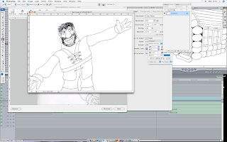
Most, if not all, of the images in my current project's outcome have been drawn traditionaly, scanned and edited in adobe photoshop, and later arranged in sync to the audio with Final cut pro.
After going over the sketch with 0.7 fine pen and rubbing off the pencil marks, I scanned the image onto the computer; the scanner was an EPSON at the most. This proved to be a challenge on some cases as I did the sketches on an A3 sketch pad, and at some times, the images would end up even larger than the scanner itself.
Before I scanned the image, I made sure the following diodes were added to the scanner settings. First I had to set the 'Scan To Folder' to the folder in my key which contained all the current scans. Then I had to name it on what the image is about. Finally I set the Automatic Task to Adobe Photoshop CS3, so once the image is scanned, it will automaticly open on that programme.
Once the image is scanned and opened up onto Photoshop, the first to do would be to rotate it to the right angle. To do that, I go to Image - Rotate Canvas, then I click on whatever is necessary at the time; Here, i'd click onto 90 CW (clockwise). With that sorted, it's tome to sort the Brightness and contrast. I go to Images - Adjust - Brightness/Contrast to bring up the tiny window.
I click onto Use Legacy First, because If I put my arrangements first and then click use legacy, it just returns them back to 0. After clicking on Use Legacy, I set both Brightness and Contrast to +51, just so the background is white, and only the lineart can be visible.

With the image now set and cleaned up with the rubber tool, I can now save it as the same image I set to the key. After that, I can upload it to Final cut pro.

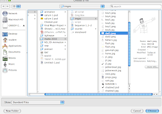
From Final Cut Pro, I go to the colomn on the left, ctrl-click and select import-files. Then from this window that appears, i select the image that I had saved form Photoshop. You can also get the import option from the file tab at the top row.

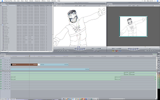
Now that the image is uploaded onto Final cut Pro's roster, I can set it onto my outcome timeline. When a still image is added onto a timeline for the first time, it's rougly ten seconds or longer. But not only can I stretch and squash it's duration, but I can also make it move, or 'animate', by adding command points on the start and finish of the duration.
And that's how I imported traditional media to my final outcome. It's weird, because I did more work with flash than I did with Final cut, yet I know more about final cut than I do Flash. I think it's because I understand the fundamentals of Final cut More than I do With Flash.

Wednesday, 3 February 2010

Matthew's Jabberwocky?


This is an illustration of the poem jabberwocky by an anonomous artist. The Jabberwock in this portrait looks nothing like the manxome foe from the original illustration. The tumtum tree is somewhat similar to my idea of the kinesthetic image, however.