Friday 19 March 2010

Final major project idea proposal

I am aiming to produce a full book, with a front and back cover and ten pages, and a poster promoting the book with monster characters in the same style. This will help aid my experience in character design and improve on overall layout.


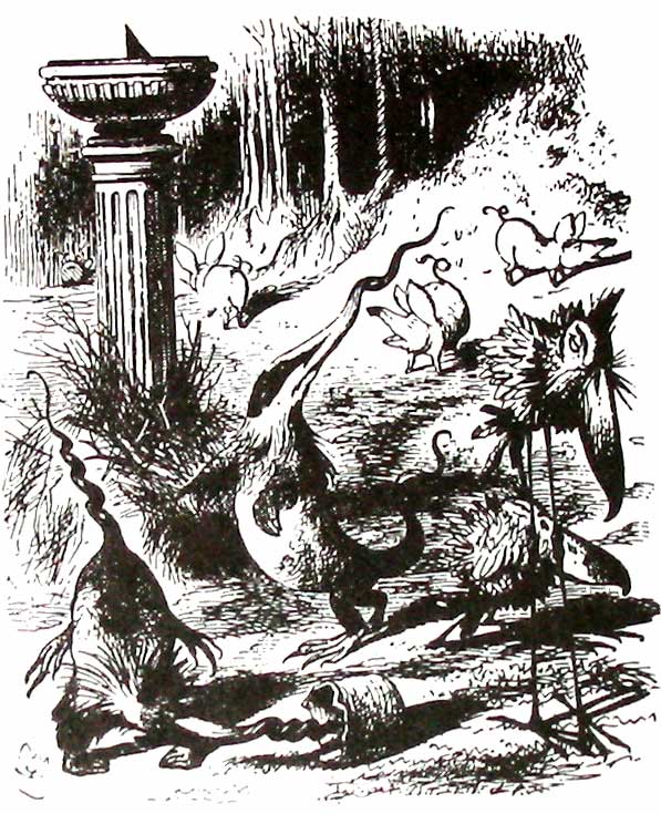
First, I would create a mind map on how several creatures differ realistically or otherwise. I will begin research on character designs for groups of monsters or animals. I should note on how their unique styles make them more recognizable. I will then research on how promotional posters are used to efficiently advertise their target product to their target audience. I need to look at layout, colour schemes and textures; will a dark and gray poster appeal to young children? I need to take these questions in mind in order to make a successful advertisement. I will also need to learn how to create a book, as that is part of the outcome.

I intend to create a very wide range of characters; naming each creature, describing their personality, and eventually sampling some colour scheming for each one. Much of these designs will be scanned onto the computer and edited on Adobe Photoshop.

Week 1: Research

Week 2: Research

Week 3: Design development/ source materials

Week 4: Design development/ source materials

Week 5:Review week/ Final development

Week 6: Design outcome

Week 7: Design outcome

Week 8: Design outcome/ Evaluation

I will write everything I have done on this project in a diary, giving a date on each day’s worth and writing what I need completing in my spare time. The promotional poster will be printed in A1 and mounted on a larger black mount, ready to be displayed in the Mansfield museum. The book itself will also be on display alongside the book.

Podcast evaluation

For research, we had to figure out how Podcasts differ to that of other websites. The first thing I did in research was to review the RSS. I then looked up several websites that included videos in their options of the websites.

We then started on our design development. I got the general idea to have at least 4 designs on one sheet. I managed to come up with three designs, one with some connection to my research. I then finalized one of my ideas using pastel colours.

I made my website template on Adobe photoshop, as it is the easiest for me to make it on. I added all the text and images needed for all four pages on the same document by grouping them all respectively. When it came to slicing, I made grids for all the pages, and arranged the invisible keys so only one of the groups was visible, starting with the homepage. I had to merge some slices after slicing from the guides, because there were far too many slices otherwise. I saved the homepage as web and devices before I went to slicing the other pages. At the end of my slicing and web saving I had 10 web pages that I soon uploaded to Dream weaver.

Linking all the pages seems like a true difficulty, but after a thorough tutoring the whole process of linking the pages was so simple, I literally flew through the problem with ease. The problem I had soon was to add my videos onto the website, which was soon solved with another thorough tutoring.

The part in which I enjoyed most of this project would have to be the design. It was actually quite interesting when I got to link my research to one of my ideas, of course I understand that was what we were suppose to do the whole time.

Discovery Network website


This website has a very plain and square layout. It’s not an explosive design. There are also far too many ads on the site, which would drive me off this site more. The channels don’t seem very visible either. You should be able to find the pod casts straight away. Overall, this is a very bad example of a pod cast website. I know now not to go to this direction when designing a podcast.

BBC Pod casts website


This official website shows all the British radio channels that have available pod casts, as well as the most popular of the pod casts from all those stations. The layout used is very simple and it makes the highlighted pod casts stand out the most, which in a sense is vital. The pod casts include highlighted events from said radio stations i.e. charts, interviews etc.

Thursday 18 March 2010

Lightwave- Mechanical spider


This is a video of a real-life mechanical spider in a large scale found in Liverpool. Built by the French art company La Machine, It has been dubbed La princesse and is currently kept as a display in Yokohama, Japan.
This 50-foot arachnid-based machine took a whole year to construct, and while active and mobile (top speed is 2MPH) still requires a lot of assistance, including 16 cranes, 6 forklift trucks, 8 cherry pickers and 250 of the whole crew. Up to 12 puppeteers were strapped onto the spider while mobile; 3 were on top of the machine and 9 were underneath the body. I took at least the 9 below to control the joints on the legs. In total it had 50 axes of movement to arrange at the same time.

Wednesday 17 March 2010

Digital storytelling- scanned material

Most, if not all, of the images in my current project's outcome have been drawn traditionaly, scanned and edited in adobe photoshop, and later arranged in sync to the audio with Final cut pro.
After going over the sketch with 0.7 fine pen and rubbing off the pencil marks, I scanned the image onto the computer; the scanner was an EPSON at the most. This proved to be a challenge on some cases as I did the sketches on an A3 sketch pad, and at some times, the images would end up even larger than the scanner itself.
Before I scanned the image, I made sure the following diodes were added to the scanner settings. First I had to set the 'Scan To Folder' to the folder in my key which contained all the current scans. Then I had to name it on what the image is about. Finally I set the Automatic Task to Adobe Photoshop CS3, so once the image is scanned, it will automaticly open on that programme.
Once the image is scanned and opened up onto Photoshop, the first to do would be to rotate it to the right angle. To do that, I go to Image - Rotate Canvas, then I click on whatever is necessary at the time; Here, i'd click onto 90 CW (clockwise). With that sorted, it's tome to sort the Brightness and contrast. I go to Images - Adjust - Brightness/Contrast to bring up the tiny window.
I click onto Use Legacy First, because If I put my arrangements first and then click use legacy, it just returns them back to 0. After clicking on Use Legacy, I set both Brightness and Contrast to +51, just so the background is white, and only the lineart can be visible.

With the image now set and cleaned up with the rubber tool, I can now save it as the same image I set to the key. After that, I can upload it to Final cut pro.

From Final Cut Pro, I go to the colomn on the left, ctrl-click and select import-files. Then from this window that appears, i select the image that I had saved form Photoshop. You can also get the import option from the file tab at the top row.

Now that the image is uploaded onto Final cut Pro's roster, I can set it onto my outcome timeline. When a still image is added onto a timeline for the first time, it's rougly ten seconds or longer. But not only can I stretch and squash it's duration, but I can also make it move, or 'animate', by adding command points on the start and finish of the duration.
And that's how I imported traditional media to my final outcome. It's weird, because I did more work with flash than I did with Final cut, yet I know more about final cut than I do Flash. I think it's because I understand the fundamentals of Final cut More than I do With Flash.

Wednesday 3 February 2010

Matthew's Jabberwocky?


This is an illustration of the poem jabberwocky by an anonomous artist. The Jabberwock in this portrait looks nothing like the manxome foe from the original illustration. The tumtum tree is somewhat similar to my idea of the kinesthetic image, however.

Jabberwocky- Author's Glossary


Listed below are words that were used in the Jabberwocky poem, as they were described as one of the characters in Lewis carrols' book:

Bandersnatch — A swift moving creature with snapping jaws, capable of extending its neck.

Beamish — Radiantly beaming, happy, cheerful.

Borogove — A thin shabby-looking bird with its feathers sticking out all round, "something like a live mop". The initial syllable of borogove is pronounced as in borrow rather than as in worry.

Brillig — Four o'clock in the afternoon: the time when you begin broiling things for dinner.

Burbled — Possibly a mixture of "bleat", "murmur", and "warble".Burble is also a pre-existing word, circa 1303, meaning to form bubbles as in boiling water. The dutch word broebelen still remains this meaning of bubbling boiling water.

Chortled — Combination of chuckle and snort.

Frabjous — Possibly a blend of fair, fabulous, and joyous.

Frumious — Combination of "fuming" and "furious".

Galumphing — Perhaps a blend of "gallop" and "triumphant". Used to describe a way of "trotting" down hill, while keeping one foot further back than the other. This enables the Galumpher to stop quickly.

Gimble — To make holes as does a gimlet.

Gyre — To go round and round like a gyroscope.[5][10] However, Carroll also wrote in Mischmasch that it meant to scratch like a dog. The g is pronounced like the /g/ in gold, not like gem.

Jubjub — A desperate bird that lives in perpetual passion, according to the Butcher in Carroll's later poem The Hunting of the Snark.

Manxome — Fearsome. A portmanteau of "manly" and "buxom", the latter relating to men for most of its history.

Mimsy — Combination of "miserable" and "flimsy".

Mome — Possibly short for "from home," meaning that the raths had lost their way.

Outgrabe (past tense; present tense outgribe) — Something between bellowing and whistling, with a kind of sneeze in the middle.

Rath — A sort of green pig.

Snicker-snack — An onomatopoeia of unclear meaning, possibly referring to sharpness.

Slithy — Combination of "slimy" and "lithe." The i is long, as in writhe.

Tove — A combination of a badger, a lizard, and a corkscrew. They are very curious looking creatures which make their nests under sundials and eat only cheese. Pronounced so as to rhyme with groves. Note that "gyre and gimble," i.e. rotate and bore, is in reference to the toves being partly corkscrew by Humpty Dumpty's definitions.

Tulgey — Thick, dense, dark.

Uffish — A state of mind when the voice is gruffish, the manner roughish, and the temper huffish.

Wabe — The grass plot around a sundial. It is called a "wabe" because it goes a long way before it, and a long way behind it, and a long way beyond it on each side.

The Muppets show's interpretation of Jabberwocky

In the muppet show, the creatures were mostly based solely from the book (with the acception of the father figure and the beamish boy played by the regular muppets). Much of the lyrics in the poem were described in choreography.

Flanimals


Flanimals is a series of books written by Comedian Ricky gervais, and illustarted by Rob Steen.
In these books, We are shown a large variety of creatures and small information about them. These creature are very insane looking. In-fact the purpose of this book is solely for comedy.
This would be good to look at for when I start designing my creatures for the Jabberwocky, as they are also very strange and surreal.

Sunday 31 January 2010

Mike mosedale- Illustrator


Michael Mosedale is a famouse british illustartor and cartoonist who's cartoonic 'rushed' style can be seen in Newspapers and books all over the UK. His most noted work would have to be in the book collection of Harry Oliver; the most noted of these books is titled March Hares And Monkey's Uncles.

Thursday 28 January 2010

Podcast.com


Podcast.com is a website with the biggest collection of podcasts on the internet. All the podcasts are grouped repeatedly in categories, and are often shown on the front page whenever they are the most popular.

Wednesday 27 January 2010

My view on the Jabberwocky nouns

One of my ideas for the storytelling project is to create a digital story based on the poem Jabberwocky. I thought it'd be a good idea to base the poem on MY views of the strange nouns and verbs used in the poem; even if I don't use the poem, It could go for a good grade.

Verse 1

Brillig: To me, this sounds like a foggy day, when the clouds are far low on the ground, yet you could actually see the puffy clouds.

Slithy Toves: Slithy seems slimier to slimy, except with a dry feeling to it as well, much like reptilian. Toves would be part badger, part parrot on my point of view. So a Slithy Tove would be a Badger with parrot claws and head, and lizard like skin.

gyre and gimble: To gyre and to gimble sounds rather cheerful, enough to dance to, even. So to gyre would be to twirl, and to gimble could be to jump (or vice verse, doesn't matter much)

Wabe: When I think of this word, I think of a mid-large spacing of a forest, formed by a flattened willow tree.

mimsy: That sounds very small and timid, almost shaking. So to be mimsy would be to shiver almost.

Borogoves: This will be an odd one; a large vole- like mammal with frog's legs and a large pointed nose. I never said this was going to make sense.

Mome Raths: Mome would possibly be large and fluffy, and a rath would be like a turtle. A big fluffy turtle? Who'd have thunk it?

Outgrabe: To Outgrabe would be to search in the trees for fruits and berries. So if a Mome Rath Outgrabes, you might wanna move back a bit.

Verse 2

Jabberwock: To be truthful, this mythical menace has to be a dragon, but what would it look like. I suppose most of the top half of John Tenniel's illustration would remain,
except my version would only have one buck tooth, it's head would be slightly pointed and the arms and hands would be shortened. The bottom half, on the other hand, would be more T-Rex like, big sturdy legs with a thick tail. At least that's what I reckon it'd be like.

Jubjub bird: Obviously, it'd have to be a bird; but what kind? I'm thinking a crow-shaped body with a extremely large beak and long-ish legs.

Shun the frumious Bandersnatch!: To shun would sound like as if you were to look up to something.
Frumious sounds like a very sneaky personality, to be frumious would be very conniving and be two-faced, and always leaning forward. Imagine Quasimodo impersonating Dick Dasterdly.
Finally, a Bandersnatch; sounds very mischievous indeed. It could well be a giant polecat that hides in the shadows. A combo like a frumious Bandersnatch sounds even scarier than the Jabberwock.

Verse 3

Vorpal: To be vorpal would be trusting and bright, like a superhero.

Manxome: I have a feeling this might mean mysterious in an mythical sense. You know of something manxome because you've only heard of it.

Tumtum tree: A tree, obviously, but what would be it's characteristics? I'm imagining a rubbery texture with a somewhat tribal look to it. Like a totem pole made of erasers and full of leaves.

Verse 4

Uffish: To be in an Uffish thought, could be in a foolish one. You'd space out as you think.

Whiffling through the tulgey wood: If you were whiffling through some bushes, you would be blowing them away (rather than pushing them).
A Tulgey wood wood perhaps be a very bushy one, filled with leaves form top to bottom.

Burbled: when you burble, you would be gurgling quietly to yourself.

Verse 5

Snicker-Snack!: The hero's vorpal blade probably clashed with the creatures claws and thus created a loud clanging sound.

Galumphing: This has a very low-tone feel to it. To Galumph would be to tread on mud with a heavy object

Beamish, Frabjous, Callooh and Callay will all be sounds of relief and joy.

Beatrix Potter- Illustrator


Helen Beatrix Potter was a very popular illustrator during the 17th-18th century, with her most noted work being the tales of Peter Rabbit. Her traditional illustration is, in a sense, realistic, but also very colourful. The anthromorphic charcter in her stories are only fictional, but you can tell that she used real animals as models for her works.

E.H. Shepard - illustrator


Edward Shepard was a well-known illustrator from the 19th-20th century. His most popular work is that from Wind in the Willows and Winnie the Pooh.
His style of illustration is very artistic, with a slight sense of comic. His outlines are somewhat sketchy, and he uses several strokes of lines to determin light form shading.

Photo Manipulation: Zink-PoGo from Frenky on Vimeo.

This is an online tutorial on how to create advanced photo manipulation. I absolutely love the 'dirty film' look of the sequence. Not only does it have a sense of nostalgia, but it uses a variety of colours that differ greatly and yet somehow still manage to work together. The film is done in speed-motion, meaning the recordings are sped up to reduce time wasted and leaves a nice style that seems similar to stop-motion.

The sound used also has a sign of nostalgia. The digital trumpets and other instruments remind me somewhat of an old video game.

Stories from kill on Vimeo.

This is a music video portraying a story about a girl who had her heart broken. The rain and the ripples on the water represent the sadness in which she has gone through. The seasons and the moment of the event is displayed by the mentions of the vegetation that dropped off the trees. The dull blue colour alsoexpresses the depression in this sequence.

Digital Stories from Stephen Ng on Vimeo.

This is a story told by two old ladies, imported to visuals with the help of magazine scans. You can hardly hear the ladies talking, but you don't need to. Every image found in this video reflects on what the old ladies are saying. The magazine scans also reflect a sense of nostalgia, because many of these scans are from very old images that date back as far as 1950s, perhaps even further.

wikis from tarantela on Vimeo.

This video uses toy robots and flat images cut out to describe the use of Wikipedia. The robots represent the average person who would spend most of their day on the computer, forever functioning with hardly any sign of emotion. The film is done in stop-motion in a presentation format, as if it is presenting itself. It's also displayed somewhat in 2D, to show it's simplicity.

digital storytelling from tarantela on Vimeo.

This clip shows what seems to be three university students using cut out drawn replicas of equipment vital for filming. The outlined drawn equipment reflect on the vitality of their usage and that they can be pursed just as simply as buying paper. The colour scheme used is very bright and colourful, which says that filming can be fun at times.

Monday 25 January 2010

Page Master- Dr. Jeckle lighting

This is a screenshot taken from a scene in the movie PageMaster (1994). In this scene, the heroes of the plot come across the iconic Dr. Jeckle, and has a drink with them (the drink then transforms him to Mr. Hyde). The lighting of this particular moment adds tension to the moment as he consumes the toxic drink.
In one of the finals for my project, I imported the lighting from the same moment in the movie, to create the same tension portrayed in the animation.
I created the lighting itself by creating a new layer and going over the lighting areas (taking note of the tips taken from the itchy animation website, to make the lighting seem coming from the right) and filling the path with a bright blue, the same colour scheme used the tense moment of Dr. Jeckle in PageMaster. I finished the lighting off by adding a stroke blend with a darker blue, to add more luminosity.

Design process- scanning in textures


This is currently the last piece of the six-sheet final for the project I am currently finishing. It looks good so far, but I want it to have even more detail, more texture. So what I've done is scan unique textures from a scrunched up tissue.
Not only does it have a soft near invisible texture to start, but the dark lines give a nice mix of contrast.
I dragged this image onto the final and re sized it so the texture is the main focus.
What I did here was alter the layer properties of the layer so it forms into the image further. Here, i experimented by altering the layer property to 'Overlay'. However, this made the background too bright; as a result the character doesn't stand out as much.
Here is the same image with the same layer, this time it is set to 'Multiply'. This makes the character stand out more, but still keep the hard lines that differ in contrast.
For the final touch, I desaturated the tissue image and increased the contrast by 100. Desaturating the image removed the unnecessary colors; the base green of the tissue itself and the blue line that collided with the textured lines. Increasing the contrast strengthened the lines so they stand out more.

Friday 22 January 2010

What is RSS?


RSS, or "really simple syndication", is a large group of web feeds that is the key in updating and publishing material online. The basic objective to create the RSS states back to 1995, when computers, and especially the internet, was still at an early age. The format itself didn't go up online until 1999, and then in 2005-6 it finally became a public format.

Trivial pursuit -interactive website


This is the official website for the Trivial pursuit experiment. The experiment simply examining which of the following two genders are more intellectual. The interactivity is superb. However while playing the game, animated and everything, I was completely oblivious at the fact that I was actually playing against others online. I think to improve this would be to make it seem more obvious to the player that he/she is online with other competitors.

Fred Frap's imaginary home page- worst website designs


This is the 'Official' website for Fred Frap and his imaginary friends. It is absolutely horrible. This wouldn't even make a pass criteria in a college session. The text is too small and complex to understand, and even so, it's too hard to see with he background colour. The photography is in grayscale; and therefore just don't mix with the colours used in this website, which is a lot. I would highly doubt there would be any animation in this website, at least any necessary.

Save the turtles- Interactive website


this is the official website for the game Save the Turtles. The game is only available on the DSi via the DSi ware system. This website is very colorful and bright, which explains that the art style of the game itself is aimed at a young audience. It's very interactive and it animates stupendously. Even if you scroll your mouse cursor over an image and not click it, it will still animate. The website consists of a homepage, and pages individually for information on the game itself, images and videos, 'downloads' and even a website detailing how to purchase this game.

Design process- creating the Greenhouse page.

I will show you how I have progressed to a page used for my interactive survival guide.
Using a black background layer, I started with a pen tool and used it to create a path that would later represent the frames of the green house. The black layer will not be part of the final design. It's sole purpose is to let the white of the greenhouse stand out only temporarily.
Once I was happy with the path made by the pen tool, I went onto the paths window and added 'stroke path', ensuring the brush tip was a thick white.
On a new layer, I started creating the soil. This brush tip shape is very convenient for this task, because it has a nice textured feel to it.
This is the 'prototype' snow layer. I made the snow by using a large brush tip shape as shown. It won't be used in the final, but it proves a useful asset in this stage.
This is a plant photo I found on the internet. I used a soft-tip eraser tool to remove the exterior around the bush. I then used a magic wand tool to select the plants, so I can drag it to the greenhouse image in a new layer.
This what the image currently looks after the plant has been pulled in. The next step was to alter the perspective of the bush to fit it by the wall of the greenhouse.
To do this I used a variety of transform techniques, found in the edit tab. These included 'skew', 'distort' and 'perspective'.
After adding a blue-to-white gradient (with white being at the bottom), I went back to the Greenhouse frame layer and used the 'blending options' to make the frames blend in.
I simply used a stroke, made it slightly big with a 100% opacity and set the type to 'Overlay. This ensured the greenhouse frames were part of the image, and that it also had smooth sides to it as well.

This is not what the finished piece looks like. This is merely a process through the centre of production. The final version has more detailed snow, and plant bushes on both sides.

Wednesday 20 January 2010

Design process- the shadow

On one of my outcomes I had to figure out how to create a shadow on the floor. One technique I used included duplicating the layer of the object in which the shadow is casting from.
With the duplicated layer, I then rotated it 90 degrees counter-clockwise. Now I need to make it seem like its casted from the light and the previous layer.
Here I've stretched the shadow to make the light behind the previous layer seem pretty strong. But the shadow still doesn't look anything like it's casted from the light and the object.

If you go onto edit-transform, you will notice there are a variety of tools to further distort such image. For the most part I used the skew tool and the distort tool. This shadow really helps this image stand out even further.

Itchy animation website


This website was recommended by my tutor after he first reviewed my work in progress. It's a portfolio website, meaning it contains work from a single artist. This website also had a lighting tutorial, which proved very helpful in my project.
The website itself is very well presented, with clear buttons and a simple gallery layout.

Design process- beginning of the end of sanity

Here I'll show you the progression from the 3rd of the 6 final outcomes I made.
This is currently the design of the 3rd outcome. I'm now gonna show you through the process of the exotic scent.
I start with a rectangular marquee tool on a new layer. I want to use a new layer, so whatever i do inside that section wont affect any other pat of this work.
Then I take out the gradient tool and created a linear gradient, ensuring that I have black and white in the palette. If you create a gradient inside a selection, you'll find that the gradient is only made in the selection, and not all over the page. Now I needed to distort the gradient so it looks more free-moving.
For this, I went to filter-Distort-Twirl. The twirl technique makes the gradient image seem less inanimate. But now I want the bottom part to align to the hole in the vase and make the black of the gradient disappear.
To remove the black, I simply set the gradient layer to screen, and the gradient itself was good to move to the hole of the vase. But after then, the gradient seems cut. So I extended the right of the gradient, selected it with the rectangular marquee tool and rotate the gradient in the new selection just slightly.
A little bit more stretching for the selected gradient, and a bit of clone stamp and healing brush, and the extensions good. But it now looks too blocky.
So I just trimmed the sides using the pen tool. The extension is now done and clean. Now the next problem, the bottom part of the gradient is too thick to get in to the vase.
A bit of squashing, and the problem is sorted. Now to colour the gradient and add a more interesting background.
To colour a black and white gradient, I went to hue/saturation and ticked the colorize box, and with that I made a very saturated, very pink gradient. For the background, I simply used the difference clouds, which can be found in filter-render-difference clouds.
There is a brush tip shape in photoshop which has a unique star style to it. I used that brush tip to add a more magical feel to the scent. But the image itself doesn't seem thrilling enough.
Returning to the gradients, I made a black white radial gradient (reversed) on a new layer with the layer's properties set to multiply. I also added some sparkle on the vase using the same brushes used for the stars in the scent.

From here I wanted to make the scent stand out the most. I merely pushed the scent layer above the multiplied gradient layer.
This is not the completed version of this outcome. The completed version will have more detail and will have more effort put to it.