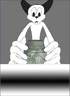
Here I'll show you the progression from the 3rd of the 6 final outcomes I made.

This is currently the design of the 3rd outcome. I'm now gonna show you through the process of the exotic scent.

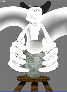
I start with a rectangular marquee tool on a new layer. I want to use a new layer, so whatever i do inside that section wont affect any other pat of this work.

Then I take out the gradient tool and created a linear gradient, ensuring that I have black and white in the palette. If you create a gradient inside a selection, you'll find that the gradient is only made in the selection, and not all over the page. Now I needed to distort the gradient so it looks more free-moving.
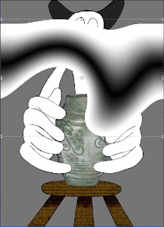

For this, I went to filter-Distort-Twirl. The twirl technique makes the gradient image seem less inanimate. But now I want the bottom part to align to the hole in the vase and make the black of the gradient disappear.

To remove the black, I simply set the gradient layer to screen, and the gradient itself was good to move to the hole of the vase. But after then, the gradient seems cut. So I extended the right of the gradient, selected it with the rectangular marquee tool and rotate the gradient in the new selection just slightly.

A little bit more stretching for the selected gradient, and a bit of clone stamp and healing brush, and the extensions good. But it now looks too blocky.

So I just trimmed the sides using the pen tool. The extension is now done and clean. Now the next problem, the bottom part of the gradient is too thick to get in to the vase.
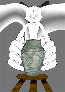

A bit of squashing, and the problem is sorted. Now to colour the gradient and add a more interesting background.
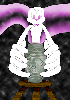

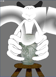
To colour a black and white gradient, I went to hue/saturation and ticked the colorize box, and with that I made a very saturated, very pink gradient. For the background, I simply used the difference clouds, which can be found in filter-render-difference clouds.

There is a brush tip shape in photoshop which has a unique star style to it. I used that brush tip to add a more magical feel to the scent. But the image itself doesn't seem thrilling enough.
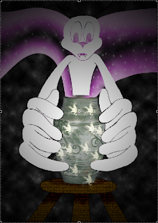

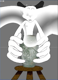
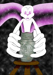
Returning to the gradients, I made a black white radial gradient (reversed) on a new layer with the layer's properties set to multiply. I also added some sparkle on the vase using the same brushes used for the stars in the scent.

From here I wanted to make the scent stand out the most. I merely pushed the scent layer above the multiplied gradient layer.
This is not the completed version of this outcome. The completed version will have more detail and will have more effort put to it.

No comments:
Post a Comment