Monday, 18 January 2010

design process- detailing the door.

The first of my outcomes included a door with a narrow opening. I was fortunate to get a photo of a door with the right characteristics necessary. However, it included objects and details that I did not want to include in my final.
So I started manipulating this photo by first removing the exterior that can be seen in the gap of the door. For this I used the pen tool to create a path in the gap, and simply covered it in black using the fill path option.
So now the door looks like it has something dark and mysterious at the other side of it.
For here, I now want to remove the unnecessary details such as the fire signs. To do this, I simply used the clone stamp tool to replicate the blank walls over the signs, and the healing brush tool to blend the replicated areas to the rest of the photo.
This is the end result of this process. Compared to the final outcome in which this is included in, this door is all of just one layer.

Wednesday, 13 January 2010

Beginning of the end of Sanity- Outcome process

On this post, I will show you the techniquies I used to make the effects and etail of one of my outcomes for a college project.
So Currently I have three layers, the character, the black blocks on each side, and the grey background.

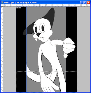
As you see, I've made a rectangula select tool. With that selection still valid, I go ahead and make a new layer.

On my new layer, I make a line gradient in the selction. For now I just make it black and white to reduce complication.

On the layer properties section, i set the layer to screen so the black becomes invisible and leaves a transparent white.

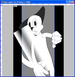
I then rotate the gradient to get it to a position ready for the twirl tool, found in the filter tab under distort.

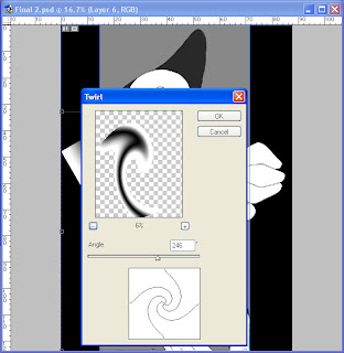
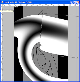
As the preview shows, the result will leave a shape which I don't want, but this can be sorted later on inthe process.
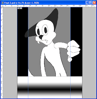
The twirled gradient still isnt the finished effect I wanted. First off, it's too thin, and doesn't pose as the main attraction to the outcome.
So what I've done here is expland the effect lengthways. But it's still not right, any thicker and it would look horrible. I have to find a way to extend the top right end and remove the excess on the top left.

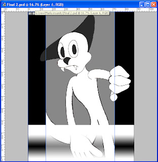
to exend the end on the top right, I simply selected that part with a rectangular select tool. I also rotate it to make it fit to the whole effect. But there is still the question of the excess parts aorund the sides.

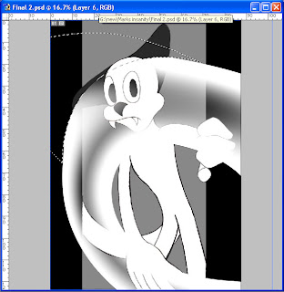
for that I used a pen tool to make a path and made sure at least one side is curved for the effect. then going around the excess, I turned the path into a selection and delecting everything on that layer in that selection.

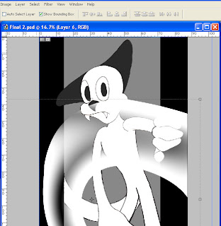
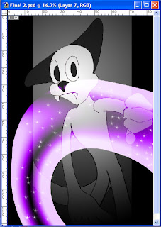
I'm now left with a nice, clean curved gradient that tickens on one side, and has an extra transparent area near the charcter's nose.

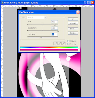
I am now hapy and willing to colour the gradient effect. To do this I go onto the Adjustments tab under image and select hue/saturation. Then before I do anything else, I click the colorize button on, so it fully colours the image, and not just try to change it. I then continue to toggle with the hue, saturation and lightness until I have the right colour mix for an 'exotic scent'.

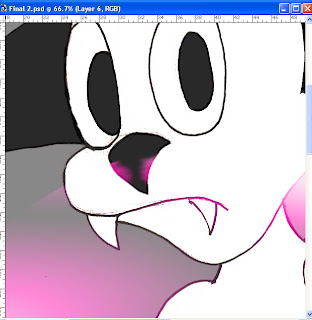
For extra detail, I erase any of this scent on the charcter's nose, and smudge it on both sides, to give the sense that he is smelling the thick aroma.

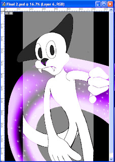
Finally for the final touch I added white stars which I happened to find on the paint shape tab in the arrow next to the brush size indicator.
Now the exotic scent is finished but this page isn't quite done yet. It needs more depth and feeling of dark to it.

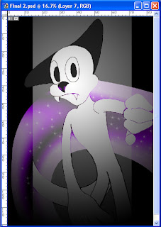
So what I've done here is make a new layer, create a radial gradient, still in black to white only this time it's in reverse. I've also set the layer to multiply, so the whith becomes invisible, leaving a blurry black ring. But now we have a new problem, this layer has effected ALL layers behind it, especially the exotic scent. As I mentioned before I wanted it to stand out the most.

The black gradient was a very minor problem however, as I only had to push the layer containing the scent above the black gradient.
And there you have it. This is how I created an exotic scentusing only Adobe Photoshop 7. The best part of this outcome was looking back at that sparkly scent after working so hard on it.
Next time, I'll show you how to do the same thing but coming from a object as a source.

Saturday, 9 January 2010

Epic Mickey Concept art

Epic Mickey is a WIP videogame being developed by Warren Spector of Walt disney studios. The obljective in the development of this game is to restore the Mickey mouse franchise to the modern days.

The first concept art helps identify the genre and the style of the game. The development team have planned to return some old and forgotten parts of disney (ie Small world and the haunted masion) and add to it a dark distorted surrealism.
The large liquid creature in the Backdrop is the Phantom Blot, a vilain taken from the old Mickey mouse comics. Mickey also has a design change, his arms and legs are longer then the stubby style of the 90s and the 'noughties'.
You can tell by looking at the authenticity of the atmosphere that this concept gives the feeling that this level is based in the inside. There is also a hint of glamor with the red-pink glowing in the gates and buildings, which on the subject seem influenced by that of oriental and asian architect. With that in mind, this could either be influenced by the Small world ride, or based on rejected material from the movie Mulan
This concept art would assumaby ressemble a level which represents Agrabah, the most used set from Disney's Aladdin. Hints for this theory are the peach-shaped rooftop buildings, more than likely influenced by arabian architect and the magic carpet which can be seen from a distance. The blue glow coming from the centre gives this art a sense of luminosity and can be refered to the Cave of Wonders scene from Aladdin.
Partof the gameplay of Epic Mickey is the weaponry Mickey mouse uses, such as a magic brush that can either repair or remove infected buildings and objects. This artwork, then, is a preview of the 'disney' magic that is shun whithin the game. The thickness of the paint from the more colourful side can be seen remarkly with the small, unnotiable shadows.
This is somewhat similar to the towers from Disney's Sleeping Beauty and Beauty and the Beast. The shattered columns are vital to the design objective to the game genre. the green light coming from the crack of the ground indicate toxic waste or anything nucular or scientific is near.
Much like the previous art, this too has parts form Sleeping Beauty and Beauty and the Beast. However, the perspective, layout and shadows indicate this is more planned for an evil lair type level.

I love how Warren Spector managed to compare his concept work to that of the classic disney films. Here, he's looked up parts of the tower from Disney's Sleeping Beauty, and import the design contextual to the concept seen above. The run down and near destroyed look makes it more the suspicious to actualy be the tower in which the captured moments in Sleeping Beauty took place.

Futuristic environment


The second I saw this concept art, with it's rounded roofs and complicated shapes, I though "That is definetly of furtutristic style". The grayscale gives it a fitting feel to it, adding colour to this concept would ruin it.

3D design process- the propellers

Part of my final design including a building with a fan-like shape on top.
I started with a cylinder shape with round-pointed sides. I did this by sounding up the sides and then stretching them out.
On a new layer, I created a shape that was to be used for the popellers. The shape was made from a circle using techniques such as twist, strech and rotate.
And finaly I just simply duplicated the propeller layer three times and arranged them a such.
The design was based on concept from a flying machine by Da Vinci.


Thursday, 17 December 2009

Seneca college lip syncing

Lip synching- expression

While i've been looking all over Youtube to find many animation examples, I noticed there are many that are too expressive and many that are not expressive enough.


An example of over-expressive animation


An example of under expressive animation

I feel that over-expressive takes gives more feeling to the characters, but consumes alot of time to the animator, and that under-expressive takes are complete opposite; less time consuming, but reduces the felling of the character